Last editedNov 20214 min read
If you want to increase the number of customers who pay you by bank debit, optimising your payment pages is one key way you can achieve this.
Below are GoCardless’ best practice guidelines for payment pages, which will help you both increase your overall payment page conversion rate and the proportion of new customers choosing to pay by bank debit (also known as Direct Debit).
Our own payment pages are underpinned by these guidelines - pages that result in hundreds of thousands of bank debit mandates being set up every month.
1. Clearly display the payment methods you offer
Let your customers know how they can pay you before they enter the checkout. If your business only accepts bank debit as a payment method, for example, state this at the beginning of the payment flow.
Some of your customers are bound to have expectations about which payment methods they can use. If you don’t set their expectations clearly at the start of their payment experience, you risk disappointing or irritating them, and potentially losing them forever.
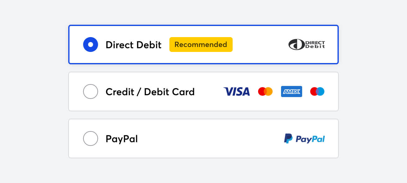
If you offer multiple payment methods, consider reordering them so bank debit is the first option shown. Having bank debit displayed first, or selected by default, can improve the selection of it considerably. You should also use a ‘Recommended’ or ‘Preferred’ label on this payment method to steer your customers towards it.
If you’re finding it difficult to switch your customer over to bank debit, consider making it compulsory. While you may have to turn down the occasional client who won’t change; you’ll free yourself up to focus on winning the right kind of business.
If you find it difficult to enforce this change on existing customers, start by including it as a condition to new customers only.
“When we engage with new clients, part of the set-up process is to complete a GoCardless mandate. We will only complete work for clients if an active GoCardless mandate is in place.”
Paul Bulpitt, Co-founder at The Wow Company – Accountants and business advisers
Darren Green from Green Pro Clean talks about his experience of making it compulsory for his customer to pay using GoCardless.
2. Prioritise privacy and security
Over the last few years, consumers have started to care more about how their personal data will be used, and how it will be kept safe.
Use simple security messaging like “Your payment is secured using 256-bit encryption”, and display lock icons close to payment detail fields to help provide an added sense of security.
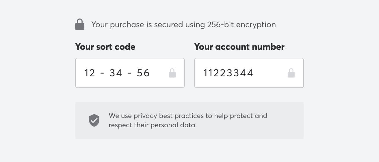
Remind your customers that their data is safe. Assuming you follow the relevant guidelines, you could mention that your payment page “Uses privacy best practices to help protect and respect their personal data.”
3. Make it clear GoCardless is your payment processor
It’s a requirement under GDPR to display the GoCardless privacy policy to your customers, as GoCardless is a data controller.

But it also comes with a benefit - highlighting GoCardless to your customers ensures they’re aware of it and helps avoid potential confusion later.
You can find our brand assets here
4. Tailor your payment pages for different countries
Localisation is all about tailoring your payment pages to where your customers are based.
Language is an obvious way to tailor your payment pages, but you should also use the terminology that makes the most sense.
For example, you could collect your customers’ bank details in the form of an IBAN. But allowing your customer to enter their details in the local format they’re more familiar with is likely to help improve conversion.
A single payment method may also have different names in different countries. Bank debit is most commonly referred to as ‘Direct Debit’ in the UK, but in the US may be better understood as ‘ACH debit’.
You can find out more about our custom payment page compliance requirements here.
5. Embed bank debit as your preferred payment method throughout your customer flow
When taking on new customers, here are some tips to getting them signed up to bank debit with GoCardless from the outset.
Talk about your payment options at the start: As soon as you have a working relationship with a new customer, talk openly about pricing, invoicing, and payment – and set clear expectations that bank debit is your preferred payment channel.
Include your preferred payment option in contracts and engagement letters: It’s hard to change habits; set your new customer up to pay via bank debit by default in your contract or customer agreement, and make sure they have to “opt-out” to pay by another method.
Address customer questions at the start: If a new prospective customer of yours has never paid via GoCardless before, they may have questions about how it works. Anticipating these questions and clearly answering them on-site is likely to help improve conversion.
Create a dedicated ‘About GoCardless’ page on your website to help explain how GoCardless fits into the payment process. And tell your customers how they can expect to interact with GoCardless after their payment is set up.
Email customers to explain the benefits of bank debit: Outline the key benefits of using bank debit and position GoCardless as the ideal solution.
Include the call-to-action to use bank debit on the first bill or invoice: Include clear bank debit payment instructions on the first bill or invoice, and on your website.
6. Let your customer know what happens next
Keep your customers informed throughout the payment process by letting them know what the next steps will be. This ties back to clearly setting customer’ expectations, which will prevent them from having a negative experience.
Then, when your customer has completed the payment setup, tell them what will happen from then on.
Here is a basic post-payment setup checklist:
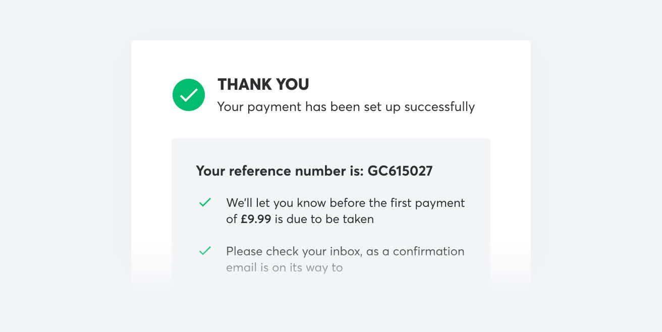
Success page: Clearly show the payment was successfully set up at the end of the payment flow.
Confirmation email: Confirm the details shown on the success page.
Highlight the name that will appear on your customer’s bank statement.
Give an idea of payment amounts and timings
Make it clear that a notification email will be sent before any payment is collected to reassure your customer.
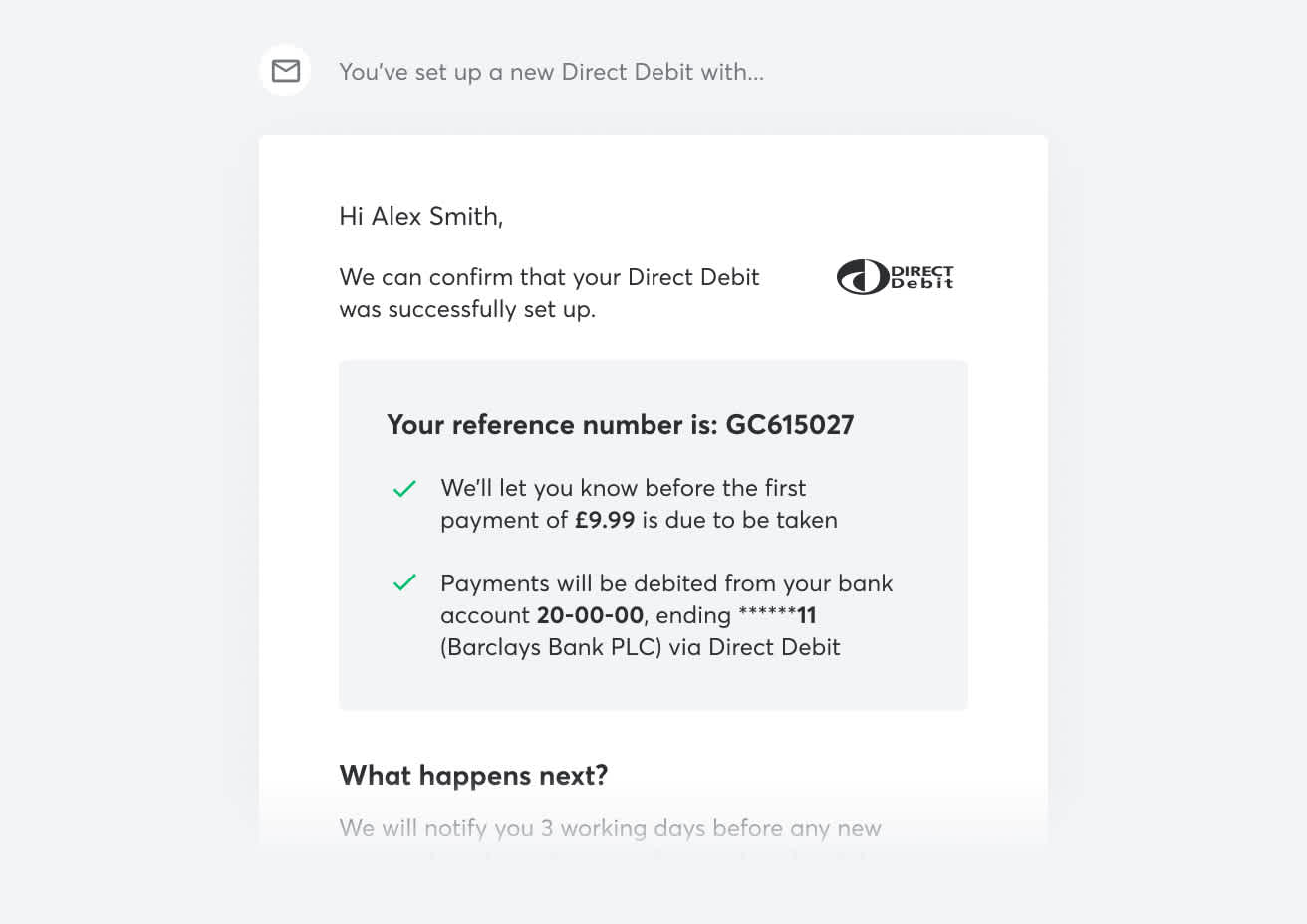
Customers are less likely to contact your organisation confused or upset if they receive clear communication.
7. Analyse your data
Finally, understanding a customer's behaviour is crucial to improving their experience. Make use of available data to help inform changes you make to your payment page.
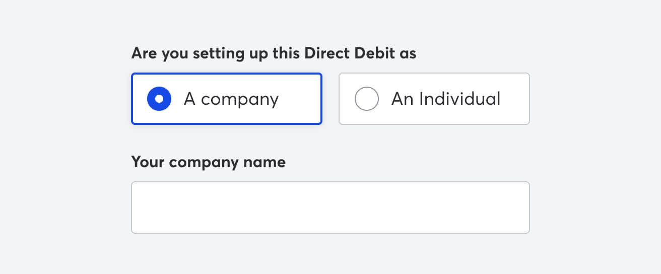
For example, you might find that the majority of your customers are business owners using a business account to set up their payment. To make the setup flow easier for this type of user you could ask for their “Company name” by default, with the ability to enter an individual's name as a secondary option.
If possible, you may want to run an A/B test to assess the impact any changes may have. This is where you show one version of your page to one group of users and another version to another group. You can then see how each variation performs, and eventually roll out the ‘winner’ to all future customers.
With every brand, use case and customer base being different, A/B testing different experiences is an important part of the process to optimise conversion.


