Visualising GoCardless' UK Growth


Last editedApr 2023
The above animation is a time lapse of customers using GoCardless for the first time. It covers the last 3 years and only maps the UK for now, with each red dot representing a new customer joining GoCardless, then becoming a blue dot for the remainder of the clip. It works even better if you view it full-screen.
It started as just something to do for fun on the side, we've been seeing a lot of growth recently and as we move into Europe and launch our new API I was curious about what it'd be like to take a moment to look back on how far we've come. The result actually turned out to be pretty interesting and the post below explains how I generated it.
Generating the Data Set
Using street addresses would have been a little messy, but luckily UK addresses include a postal code. There are around 1.8 million postcodes, providing a good level of granularity throughout the UK and Northern Ireland for around 29 million potential addresses. Sadly, this meant that the rest of Europe wasn't plottable this time around - a challenge for another day.
Data from GoCardless
+---------------------+-------------+
|     created_at      | postal_code |
+---------------------+-------------+
| 2011-09-21 22:15:44 | EC1V 1LQ    |
| 2011-09-27 12:42:17 | TA9 3FJ     |
+---------------------+-------------+
Unfortunately, postal codes also aren't distributed throughout the country in a neat grid system. There was no easy way to translate a postcode to a location on screen. What I really needed was something uniform and regular - latitudes and longitudes.
A quick search revealed several services online which provide the latitude and longitude for a given postcode, however, with 1.8m postcodes to potentially sift through, and taking into account the rate limiting on a lot of these services, this wasn't quite going to cut it.
As is often the case, it seems I'm not the first person to come across this problem and after some more searching I discovered freemaptools.com who have compiled a database containing all the 1.8m+ UK postcodes together with their latitude and longitude!
Data from the postcode data dump
+---------+----------+--------------------+--------------------+
|   id    | postcode |      latitude      |     longitude      |
+---------+----------+--------------------+--------------------+
| 1237144 | EC1V1LQ  | 51.531058677023300 | -.100484683590648  |
|  210341 | TA93FJ   | 51.229186607412900 | -2.976539258481700 |
+---------+----------+--------------------+--------------------+
After importing all of this into SQL, a few queries later I finally had the data I needed.
+---------------------+--------------------+--------------------+
|      timestamp      |      latitude      |     longitude      |
+---------------------+--------------------+--------------------+
| 2011-09-21 22:15:44 | 51.531058677023300 | -.100484683590648  |
| 2011-09-27 12:42:17 | 51.229186607412900 | -2.976539258481700 |
+---------------------+--------------------+--------------------+
Plotting Locations on a Map
R is a language I'd been looking for an excuse to experiment with for a while. It's free, open source and and after checking out some available packages like maps and mapdata it quickly became apparent that plotting latitudes and longitudes shouldn't be too much hassle.
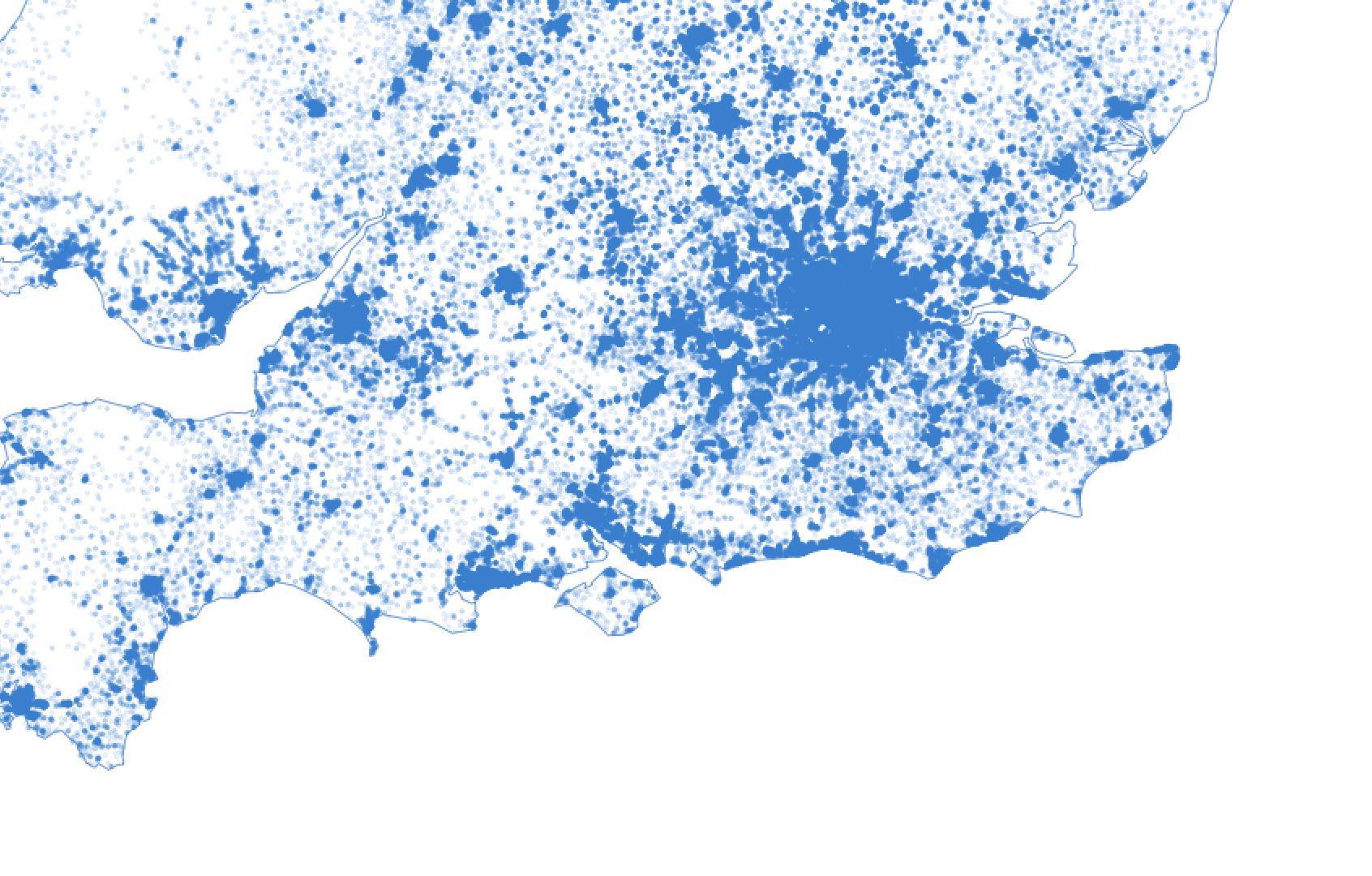
Sure enough, after a little playing around, it was possible to map all the customers represented by little blue dots.
Very exciting, but still some room for improvement - the points seemed a bit large and very messy. In areas of high density (for example, London) the map was solid blue. It was awesome to see how many people have used us but it didn't make for the best of visuals.
After toying with some point sizes and opacity values, things were looking much more interesting and the densities naturally emerged.
| Before | After |
|---|---|
 |
|
# draw.r
library(maps)
library(mapdata)

setwd("/Users/petehamilton/gocardless-maps")

# Set variables
gocardless_blue = rgb(0.31,0.57,0.85)
gocardless_blue_translucent = rgb(0.31,0.57,0.85,0.1)
par(family="Gotham-Book")

# Read data
customer_data <- read.csv("data/r-customers-export.csv", header = TRUE)

# Set output file
png("output.png", height=3000, width=2000, pointsize = 80)

map('worldHires', c('UK', 'Ireland', 'Isle of Man','Isle of Wight'), xlim=c(-11,3), ylim=c(49,60.9), fill=FALSE, col=gocardless_blue, mar=rep(1,4))
points(customer_data$lon,customer_data$lat, col=gocardless_blue_translucent, pch=20, cex=0.2)
title("GoCardless Customers", col.main=gocardless_blue)
dev.off(dev.cur())

# Execute with: R --slave -f draw.r
Where, Meet When
At this point I had plotted all the customers and made good use of the where portion of the data, but hadn't done anything with the when side of things.
The principle of animating this kind of data is generally conceptually straightforward. For each day, split the customers who were added on that day into chunks corresponding to the number of frames you want to animate per day. After rendering each chunk, output an image, then at the end, stitch them all together - you've got yourself an animation!
To better visualize the new customers I highlighted them in red to make them stand out against the previously plotted customers. I also removed the outline of the UK until the very end frames, resulting in the emergent GoCardless UK outline you see above.
Speeding Up R
Initially, the first rendering of these frames took hours and the concept of "rapid iteration" went squarely out the window. However, when you're fiddling with point sizes and opacities this doesn't really work well, there had to be a better way.
After some digging, it transpired that R was only using one of my CPUs. After looking around, it seemed that R had support for parallel operations, but in order to parallelise loops I'd need doParallel and foreach.
After altering the code to leverage these packages, I was then generating one frame on each core, in my case resulting in a 4x speed-up.
You can see the final code here. It's my first foray into R so there are doubtless improvements, in which case I'd love to hear from you at pete@gocardless.com.
Stitching it all together
The final step is to put together all the frames. Since we've named them using a %06d format, on OSX we can leverage ffmpeg to join them together.
ffmpeg -f image2 -r 60 -i output/frame_%06d.png customer-growth.mpgIf you're on linux (using AWS for example), you can also do this using avconv in a similar way.
We're gonna need a bigger boat...
At this point you may have noticed the intense heat and noise of your laptop gradually melting in a fiery blaze of screaming CPUs. Thousands of frames and video rendering don't generally agree with your average laptop. To get around this, I suggest renting time on an AWS spot instance or Digital Ocean instance. You can leverage some seriously beefy machines with a bunch of CPUs and RAM, then just SCP down the results once it's done.
Next Steps
I'm thinking of doing some more visualisations in future and there's doubtless other areas of the business I could explore, if you have any ideas, let me know. Also, if this seems like the kind of thing you'd love to do, we have plenty of other interesting challenges, we're hiring and would love to hear from you.


